The App Store set
Six screens, one argument.
The product story, in sequence, from the morning brief to the record it leaves behind.
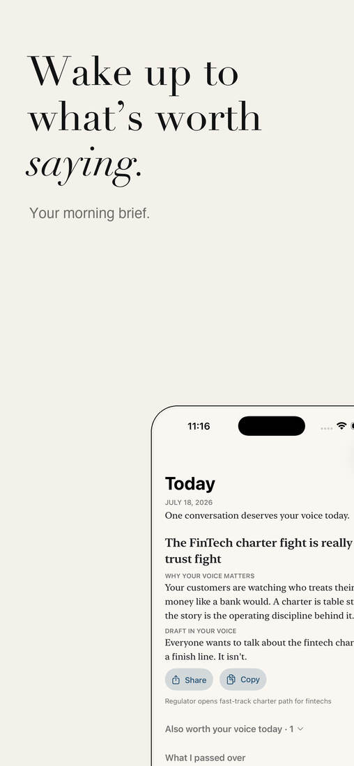
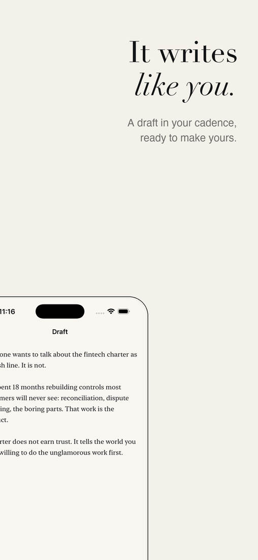
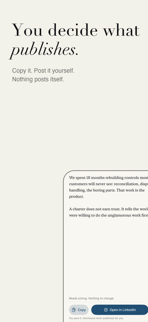
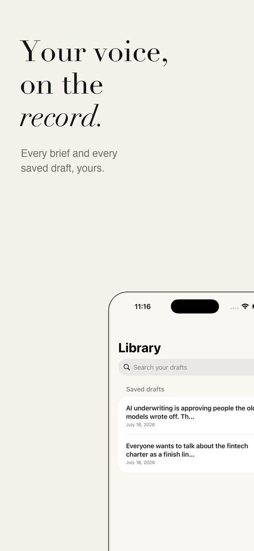
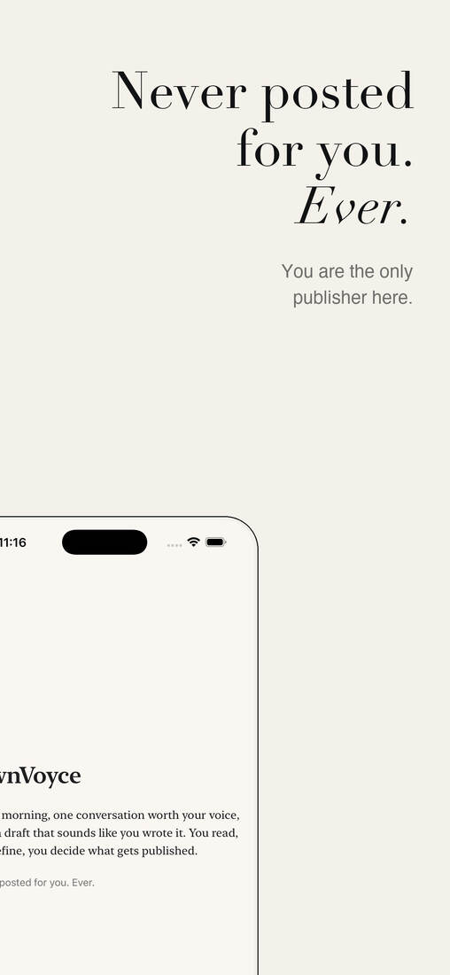
Brand, editorial system, and product for editorial judgment: it decides what is worth saying, defends saying nothing, and drafts only what deserves your voice.
The machine can draft.
The person still has to mean it.
One user in focus — the executive. OwnVoyce helps decide what deserves to survive.
At a Glance
The situationGenerative AI made professional writing sound the same, and executives got a blank box.
My roleFounder and designer: brand, product, UX, motion, strategy.
The workAn editorial-judgment product that decides what is worth saying and defends saying nothing.
What changedA working product whose daily brief names what it published, what it passed over, and why.
I built OwnVoyce from positioning through product, with a deliberately quiet brand and motion system, so the technology never announces itself and you always sound like you.
Every content tool produces the same flat, recognizable "AI voice" and starts with a blank box asking "what do you want to write?" For a busy executive, that blank box is the work, not the relief.
The hard part isn't writing. It's knowing what's worth saying, and sounding like yourself when you say it.
It started as a general AI writing tool. It became one focused thing: helping busy executives stay active on LinkedIn.
A draft is not a decision. Below is the raw thing a person typed, then the same thought after OwnVoyce cuts what doesn't earn its place. Grayed lines are what it lets go.
i keep telling people consistency beats talent and nobody believes me. then they do it for six months and it finally clicks.
Consistency beats talent. Hardly anyone believes it. Then they put in six months and it clicks.
Two letters in one shape: a curved O and an angled V. It still reads as "OV" shrunk down to a tiny app icon.
Still reads as "OV" all the way down to favicon size.
Three tones, no gradients. Even the construction diagram stays monochrome: the curved arm reads as an outline, the angled arm stays solid.
"Own" is lighter, "Voyce" is heavier. That weight change makes the two words read as one logo.
Paste a few things you've written and get a draft in your voice, plus the reasons it sounds like you. No sign-up, no pitch: the proof comes first.
The first real draft happens with no account and no payment.
Each "still missing" note is a single tap, like "add a personal example." Not a generic redo.
"Three things worth posting about today." It suggests the topic, so there's no blank page.
Kept narrow: LinkedIn only, one user, no teams or dashboards, so the core gets good first.
Click through it: learn the voice, see the result, fix the draft.
Most loading screens say "working…" This one feels like a calm breath: the two strokes open slightly, then settle. It loops, and you barely notice it.
It’s the one move the brand owns. You can recognize it from the motion alone, even with the wordmark hidden.
The word turns into the logo: the extra letters fade, the O and V slide together, and the icon appears. It loops.
The product story, in sequence, from the morning brief to the record it leaves behind.
The real Today screen. It doesn't just publish. It names what it passed over and why, on the record every morning.
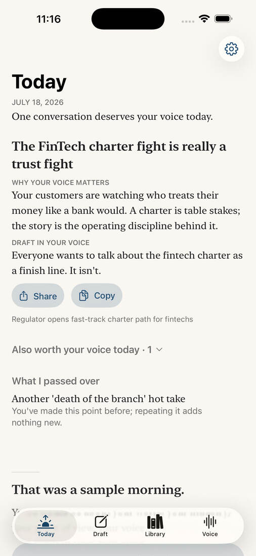
The daily brief ships with a named "What I passed over" section, with reasons.
Publishing nothing today is a defended outcome, not a failure state.
The pipeline would rather ship an honest "nothing cleared the bar today" than a weak take.
The design problem wasn’t generating words — it was building restraint into a product: an editorial system that knows when to say nothing.
Login, billing, extra platforms, dashboards: all cut. It got better as it got smaller.
Let the product prove itself before it explains itself.
If you notice the AI more than your own voice, it's doing too much.
Few colors, one gesture, lots of quiet. The best motion is the kind you barely notice.